
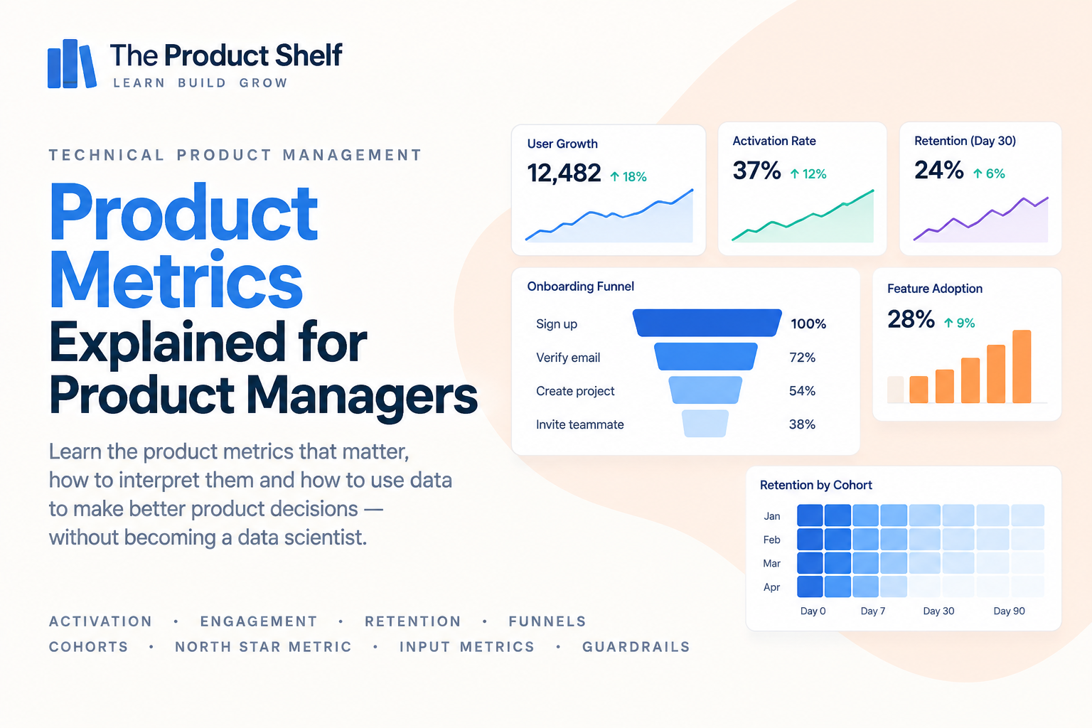
What Product Managers Need to Know About Product Metrics
Product teams have access to more data than ever. We can measure registrations, sessions, clicks, purchases, feature usage, conversion, retention and hundreds of other behaviours. The difficult part is rarely finding something to measure. It’s deciding which numbers actually tell us something useful about the product.
A metric can tell you that something has changed, but understanding what that change means requires context. More users aren’t necessarily better if they don’t stay. Higher engagement isn’t necessarily positive if it comes from friction. And a successful launch isn’t necessarily successful just because adoption increased.
For Product Managers, working with metrics isn’t about building the largest possible dashboard. It’s about choosing measurements that help you understand whether users are receiving value, how the product is performing and where you should investigate when something changes.
What are product metrics?
Product metrics are measurements that help teams understand how people use a product and whether that usage is producing the outcomes the team cares about.
They can describe different parts of the customer journey. Some metrics tell us whether users reach an important first moment of value, while others show how frequently they return, whether they continue using the product over time or whether they eventually become paying customers.
For example, a fitness application might track:
- Percentage of new users who complete their first workout
- Workouts completed per active user
- Weekly active users
- 30-day retention
- Free-to-paid conversion
Each metric answers a different question. Looking at them together gives a much richer picture than simply knowing how many people downloaded the app.
Why should Product Managers understand metrics?
Product decisions are often made under uncertainty. We launch something because we believe it will improve an outcome, but after release we need a way to understand whether that actually happened.
Imagine the team redesigns onboarding. Registrations remain stable and the new flow receives positive feedback, but fewer users reach the first meaningful action in the product.
Without the right metrics, the redesign might look successful. With them, you can see that something important has changed.
Metrics help Product Managers move beyond questions such as “Did we ship it?” towards more useful ones: “Did it change user behaviour in the way we expected?”
They also help identify where to investigate. A metric rarely gives you the entire explanation, but it can show you where something interesting — or worrying — is happening.
Vanity metrics vs useful metrics
Some numbers look impressive without telling you very much about whether the product is creating value.
Imagine a product reports:
680,000 registered users
That sounds significant, but on its own it leaves many unanswered questions. How many of those users are still active? How many tried the product once and disappeared? How many ever reached the core experience?
Compare that with information such as:
92,000 monthly active users
24,500 paying subscribers
41% 30-day retention
Those numbers begin to describe how people actually interact with the product.
This doesn’t mean registrations are useless. A metric becomes useful or useless depending on the question you’re trying to answer. The problem appears when a large number is treated as evidence of product health simply because it looks good.
Activation
Activation describes the point at which a new user reaches an early experience that suggests they have started receiving value from the product.
That moment is different for every product. For a project management tool, activation might mean creating a first project and inviting a teammate. For a music application, it might be playing several songs or creating a playlist. For a fitness product, it could be completing the first workout.
The important part is choosing an activation event that represents meaningful progress rather than simply an easy action to measure.
Opening the app isn’t necessarily activation. Completing registration isn’t necessarily activation either. The question is: what behaviour tells us that this user has actually started experiencing what the product is for?
Activation rate
Once activation has been defined, the team can measure how many eligible users reach that point.
A simplified calculation might be:
Activated users ÷ New users × 100
If 1,000 people register and 370 reach the activation milestone:
370 ÷ 1,000 = 37% activation rate
The percentage becomes much more useful when you give it context. If activation was 41% last week and has historically remained between 40% and 43%, a fall to 37% deserves attention.
The metric tells you that something changed. It doesn’t tell you why. The next step is usually to investigate the journey, segment the data and look for where the difference appeared.
Engagement
Engagement describes how users interact with the product once they are using it. Depending on the product, this could involve sessions, messages sent, projects created, workouts completed, searches performed or almost any other meaningful behaviour.
The challenge is that more activity isn’t automatically better.
Imagine a banking app where users suddenly open the transaction screen twice as often. That could mean engagement has improved, but it could also mean customers are repeatedly checking because payments are taking longer to appear.
This is why engagement metrics need to be interpreted in the context of the product and the user need. The goal isn’t simply to maximise activity; it’s to understand whether the behaviour suggests that users are receiving value from the product.
Retention
Acquisition tells you that people arrived. Retention tells you whether they came back.
Retention measures the proportion of users who continue using a product after a certain period. Depending on the product, teams might look at Day 1, Day 7, Day 30 or much longer periods.
For example, if 1,000 users register in January and 420 of them are still active a month later:
30-day retention = 42%
Retention is particularly valuable because sustainable products generally need to create repeated value. Acquiring large numbers of users who disappear immediately can make growth metrics look impressive while hiding a fundamental product problem.
The appropriate retention period depends heavily on usage frequency. Daily messaging software and annual tax software shouldn’t be judged using the same retention window.
Meaningful retention
Simply opening a product again doesn’t always mean the user is retained in a meaningful sense.
Suppose someone opens a fitness app after 30 days because they receive a notification, looks at the home screen for five seconds and closes it. Technically, they returned. But did they actually receive value?
A stronger retention definition might require a meaningful action, such as completing a workout.
This is an important distinction because metric definitions shape the story the data tells. Teams can easily create a flattering retention number by using a very weak definition of activity.
When looking at retention, it is worth asking not only “Did users come back?”, but also “What did they come back to do?”
Cohorts
Overall averages can hide important changes in user behaviour. Cohort analysis helps by grouping users according to something they have in common and comparing those groups separately.
A common approach is to group users by when they joined:
| Cohort | Week 1 | Week 2 | Week 3 | Week 4 |
|---|---|---|---|---|
| January | 100% | 58% | 46% | 40% |
| February | 100% | 62% | 51% | 45% |
| March | 100% | 67% | 57% | 52% |
Looking only at overall retention might hide the fact that newer cohorts are performing better than older ones.
Cohorts can also be based on other characteristics: acquisition channel, subscription plan, country, platform or product version. The key idea is to avoid mixing users with very different experiences into one average when those differences matter.
Funnels
Many product journeys consist of a sequence of steps. A funnel helps show how users progress through that sequence and where they drop out.
Imagine an onboarding journey:
1,000 Start registration
↓
820 Verify email
↓
610 Complete profile
↓
430 Create first project
Looking only at the final number tells us that 430 users reached the desired action. Looking at the funnel shows where the other 570 were lost.
That gives the Product Manager somewhere to investigate. If the largest drop happens during email verification, improving the profile screen probably isn’t the first place to focus.
Funnels are useful because they turn a broad outcome into a series of smaller behaviours that can be examined individually.
Conversion rate
A conversion rate measures the percentage of users who move from one state or action to another.
The general calculation is:
Users who convert ÷ Eligible users × 100
Conversion could refer to many different behaviours: visitor to registration, free user to paid subscriber, product view to purchase or trial start to subscription.
The denominator is just as important as the numerator. A conversion rate of 20% means very little unless you know 20% of whom.
Clear metric definitions prevent teams from comparing numbers that appear to describe the same thing but were actually calculated using different populations.
Feature adoption
After launching a feature, teams often want to know whether customers are using it. Feature adoption measures how many relevant users have started using that functionality.
Suppose 10,000 active users are eligible for a new feature and 2,500 use it:
Feature adoption = 25%
That can be useful, but adoption alone doesn’t tell you whether the feature is valuable.
Users may try something once because it is new, prominently promoted or automatically enabled. A stronger analysis might also look at repeat usage, retention among adopters or whether using the feature is associated with the outcome it was designed to improve.
The question isn’t only “Did people use it?”, but also “Did it become a meaningful part of their experience?”
North Star metrics
A North Star metric is intended to represent the core value a product delivers to customers in a way that can also reflect sustainable product growth.
The exact metric depends on the product. A collaboration tool might care about teams actively collaborating each week, while a fitness product could focus on completed workouts and a marketplace might measure successful transactions.
A good North Star metric shouldn’t simply be the easiest number to increase. Ideally, it should have a strong relationship with the value customers receive from the product.
Revenue, registrations or app downloads can all be important business metrics, but they don’t necessarily tell you whether users are successfully experiencing the core value of the product.
Input metrics
A North Star metric tells you about an important outcome, but teams also need to understand what behaviours influence that outcome.
These are often described as input metrics.
Conceptually:
Input metrics → North Star metric
Imagine a fitness product whose North Star metric is:
Weekly workouts completed
Potential inputs might include:
Users starting a workout
Workout completion rate
Number of active days per user
These metrics give teams more actionable levers. Instead of saying “we need to increase weekly workouts”, Product can investigate which behaviours are preventing that outcome from improving.
This creates a metric system rather than a collection of unrelated numbers.
Guardrail metrics
Improving one metric can sometimes make another part of the product worse. Guardrail metrics help teams watch for those unintended consequences.
Imagine a team redesigns onboarding to maximise completion. They remove several steps and activation increases significantly. That sounds positive, but perhaps those removed steps contained information users needed later and support contacts start increasing.
The team might therefore track:
Primary metric: Activation ↑
alongside:
Guardrail: Support contacts
Guardrail: Early churn
Guardrail: Error rate
The objective isn’t to prevent any metric from ever moving negatively. Guardrails provide context so the team can see whether improving the target outcome is creating an unacceptable cost elsewhere.
Leading and lagging indicators
Some metrics tell you about outcomes that have already happened, while others can provide earlier signals about where those outcomes may be heading.
A lagging indicator often reflects a later result, such as revenue or churn. A leading indicator is a behaviour that may happen earlier in the journey and have a relationship with that later outcome.
For example:
Product usage → Retention → Subscription renewal
If a particular pattern of product usage is strongly associated with later renewal, monitoring that behaviour may give the team an earlier signal than waiting months to see the renewal rate.
The relationship needs to be validated rather than assumed. A metric isn’t useful as a leading indicator simply because it happens earlier.
Segmentation
An overall metric can tell you that something changed. Segmentation can help you discover where.
Imagine activation falls by 8%. Before assuming that the whole product has a problem, you might break the metric down by:
- Platform
- Country
- App version
- Acquisition channel
- Subscription plan
- New vs returning users
Perhaps the result looks like:
iOS: stable
Web: stable
Android: activation ↓ 21%
Now you have a much more specific problem to investigate.
This is one of the reasons averages can be misleading. A movement in one important segment can change the headline metric even when behaviour elsewhere remains completely normal.
When a metric changes, investigate
A dashboard tells you that a number moved. Product work begins when you try to understand why.
Suppose activation falls from 42% to 34%. A useful investigation might move through several layers:
Activation ↓ 8% → Funnel → Segment → Android → App version 4.6
Perhaps the overall metric initially suggested a general onboarding problem, but the investigation reveals that almost all of the decline comes from Android users on the latest app version.
At that point, the problem has changed completely. Instead of redesigning onboarding, the team may need to investigate a technical issue introduced in a release.
Metrics are most useful when they help narrow the search rather than when they are treated as the explanation themselves.
Correlation doesn’t necessarily mean causation
Product data often reveals relationships between behaviours. Users who perform Action A may retain better, customers who use Feature B may spend more or teams that invite colleagues may be more likely to upgrade.
Those relationships can be useful, but they don’t automatically mean one behaviour caused the other.
Perhaps highly motivated users are both more likely to use Feature B and more likely to remain customers. In that case, the feature may not be the reason they retained.
This distinction matters when turning analysis into product decisions. Observational data can generate strong hypotheses, but experiments, qualitative research or additional analysis may be needed before concluding that changing one behaviour will produce another.
Metrics and qualitative research
Metrics are excellent at telling you what is happening and where. They are often much weaker at telling you why.
Imagine retention is significantly lower among users who never create a second project. The data identifies an important behavioural pattern, but it doesn’t tell you why those users stop.
Perhaps they didn’t understand the product. Maybe the first project solved their immediate need. They might have found the workflow frustrating, switched to a competitor or never intended to become regular users in the first place.
Interviews, usability research, support conversations and other qualitative methods can help explain what the quantitative data cannot.
The strongest product understanding often comes from combining both: use data to identify the pattern, then use research to understand the behaviour behind it.
Dashboards
A good dashboard should help a team understand the state of the product quickly. That doesn’t mean putting every available metric on one screen.
A useful product dashboard might include the key outcome the team cares about, the inputs that influence it, important guardrails and enough context to understand whether something unusual is happening.
For example:
North Star
Weekly workouts completed
Inputs
Workout starts
Completion rate
Active days per user
Guardrails
Crash rate
Cancellation rate
Context
Previous week
Historical range
Key segments
A dashboard full of numbers without a clear relationship between them creates monitoring rather than understanding. The objective is to make important changes visible and give the team a starting point for investigation.
Questions Product Managers should ask about metrics
Before acting on a number, start with its definition. What exactly are we measuring? Which users are included, what event counts and over what period?
Then look for context. Is the metric higher or lower than usual? What happened last week, last month or during the same period last year? Is the movement large enough to matter, or could it be normal variation?
Segmentation can then help determine whether the change is broad or concentrated in a particular group. Platform, market, acquisition source, customer type and product version are all common places to look.
It’s also worth asking what else changed at the same time. Was there a release, marketing campaign, pricing change, tracking modification or external event that could have influenced the result?
Finally, connect the metric back to a decision. What would we do differently if this number increased, decreased or stayed the same? If the answer is “nothing”, it may not deserve as much attention as it currently receives.
Do Product Managers need to be data experts?
Product Managers don’t need to become data scientists, but they do need to be comfortable reasoning with data.
That means understanding how metrics are defined, recognising the difference between an overall number and its underlying segments, knowing when averages can hide important behaviour and being able to question whether a change is meaningful.
It also means knowing the limitations of the data. A precise-looking dashboard can still contain tracking problems, weak definitions or misleading comparisons.
You don’t need to perform every analysis yourself. You do need enough understanding to ask good questions, interpret the answers and avoid making decisions based on numbers you don’t actually understand.
How many metrics should a Product Manager track?
There isn’t a universal number. The right set depends on the product, the team and the decisions you’re responsible for.
What matters more is that the metrics have a clear purpose and relationship with each other. A useful structure might include a North Star or key outcome metric, several inputs that help explain what drives it and a small number of guardrails that make unintended consequences visible.
Additional diagnostic metrics can then be used when something needs investigation.
This is usually more useful than treating dozens of KPIs as equally important. If everything on the dashboard is a priority, the dashboard isn’t helping the team understand what matters most.
Go deeper: Product Metrics for Product Managers
This guide gives you the foundations for understanding how product metrics can help you evaluate behaviour, investigate changes and make better product decisions.
If you want to explore the subject in more depth, Product Metrics for Product Managers covers activation, engagement, retention, funnels, cohorts, North Star metrics, input metrics, guardrails and segmentation from a Product Manager’s perspective, with a particular focus on moving from numbers to useful product questions.
Continue learning Technical Product Management
Product metrics become much more useful when you connect them to the systems producing those numbers. SQL and data help you understand where the information comes from, while logs and observability help determine whether a change in product behaviour might actually have a technical cause.
Continue with the Technical Product Management learning path to explore APIs, software architecture, SQL and data, observability, security and CI/CD.
Explore the book → Product Metrics for Product Managers




Product Metrics for Product Managers
Product teams have access to more data than ever. We can measure acquisition, activation, conversion, engagement, retention, and almost every interaction with our product. The challenge isn’t having more metrics — it’s knowing which ones actually help us understand what’s happening and make better product decisions.
Continue learning Technical Product Management
Product metrics are one part of the technical landscape behind modern digital products.
The Technical Product Management learning hub also covers APIs, software architecture, SQL and data, logs and observability, security, and CI/CD and releases.
Explore the Technical Product Management learning hub
Leave a Reply