
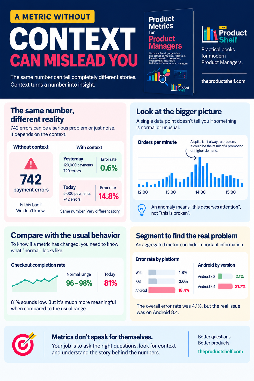
You open your dashboard and see 742 payment errors. Your first reaction is probably that something is wrong. Seven hundred and forty-two sounds like a lot, and if payments are failing, it is the kind of number that can quickly turn into a Slack message, an incident or a conversation with Engineering. You need some context for that metric.
But there is a problem. We still don’t know whether 742 is a lot.
Let’s investigate the context of the metric
If the product processed 120,000 payments yesterday, 742 errors represent around 0.6% of all payments. If it processed 5,000 payments, the same 742 errors represent almost 15%. The number hasn’t changed, but the story has.
This happens all the time when we work with product metrics. We see a number and our brain immediately tries to interpret it. Conversion went up, good. Retention went down, bad. We have 50,000 active users, impressive. There were 742 errors, worrying. The problem is that a metric rarely tells us enough on its own.
Take something as common as “conversion increased from 20% to 30%”. It sounds like great news, but what conversion are we talking about? Visit to signup? Signup to activation? Trial to paid? Which users are included? What period are we comparing? Did traffic change during that period? Has the way we calculate the metric remained the same?
The same thing happens when someone says that the product has 50,000 active users. Before deciding whether that is good, we need to know what “active” actually means. Sending a message could be meaningful activity for a messaging app. Creating or updating a task might make more sense for a project management tool. For software that people only need a few times a year, weekly activity might be almost meaningless.
There is no universal definition because the metric is supposed to represent something happening in the product. That’s why defining a metric is already a product decision. We are deciding which behavior matters, which users count and over what period we want to observe it.
Comparison matters just as much. Imagine that your checkout completion rate is 81% today. Is that bad? There is no way to know from that number alone. If checkout normally moves between 75% and 85%, today might be perfectly normal. If it has stayed between 96% and 98% for the last three months, then 81% deserves attention.
This is why I rarely find an isolated data point very useful. I want to know what happened yesterday, last week or before the last release. I want to know what the normal range looks like. Sometimes I also want to know whether Mondays behave differently from Fridays or whether there is some obvious seasonal pattern.
A number becomes much more useful when we can place it next to something.
And even then, the overall number can hide what is really happening.
Imagine that the payment error rate for our product is 4.1%. We investigate a little further and discover that it is 1.8% on Web, 2% on iOS and 18.4% on Android. Now the conversation is different. We don’t really have a general payment problem. Something seems to be happening on Android.
So we look again. Android 8.3 has an error rate of 2.1%, while Android 8.4 has an error rate of 31.7%.
This is one of the reasons segmentation is so useful in Product Management. An average combines many different users into a single number, and sometimes the experience of one group can disappear inside that average. Looking at the metric by platform, country, plan, acquisition channel, customer type or app version can reveal a completely different story.
That doesn’t mean every metric needs twenty different breakdowns. Most of the time, the overall number is a perfectly reasonable place to start. But when something changes, we shouldn’t stop there.
The same caution applies to anomalies. If orders per minute suddenly increase by 150%, something unusual has happened, but that doesn’t automatically mean something is broken. Maybe Marketing has launched a campaign. Maybe a large customer has started using the product. Maybe demand is simply higher than usual.
An anomaly is a reason to look, not a conclusion.
I think this is where dashboards can sometimes give us a false sense of certainty. They make numbers look definitive. There is a line, a percentage, perhaps a red arrow pointing down. Everything looks very precise, so it is tempting to think the interpretation must be precise too.
But the dashboard doesn’t know why activation dropped. It doesn’t know whether a conversion increase came from the change we released last week. It doesn’t know whether 742 errors are catastrophic or completely normal. It is showing us evidence. We still have to understand it.
For a Product Manager, that means getting comfortable with not jumping immediately from a number to a conclusion. When a metric moves, I want to know what exactly we’re measuring, who is included, what the denominator is, what period we’re looking at and what we’re comparing it with. If the change looks interesting, I want to know whether it affects everyone or whether a particular segment is driving it.
Then there is another question that is surprisingly useful: what would I need to know before making a decision based on this number?
That changes the role of metrics. Instead of treating them as answers, we start treating them as signals that help us decide where to look next.
That’s really what product metrics are for. We don’t need to measure everything that can be measured, and we don’t need a dashboard with fifty charts to become more data-driven. We need signals that help us understand whether users are finding value, where they are struggling and whether the changes we make are moving the product in the direction we expected.
So if tomorrow someone tells you there were 742 payment errors, don’t decide yet whether 742 is good or bad.
Ask for the rest of the story.
This is one of the ideas I explore in Product Metrics for Product Managers, where I explain product metrics from a Product Manager’s perspective: not how to become a Data Analyst, but how to understand the numbers well enough to make better product decisions.




Product Metrics for Product Managers
Product teams have access to more data than ever. We can measure acquisition, activation, conversion, engagement, retention, and almost every interaction with our product. The challenge isn’t having more metrics — it’s knowing which ones actually help us understand what’s happening and make better product decisions.
Leave a Reply